Stocks Groups Performance – Configuration of Investment Strategies

Stocks Groups Performance – Configuration of Investment Strategies
In this article from our “Configuration of Investment Strategies” series, we introduce the idea of Stocks Groups Performance in our StockPicker configurator. We use a simple visual representation to summarize how different groups of stocks perform month by month, from the best to the weakest.
We already talked about what Quintiles are in our previous article Using Quintiles for Configuration of Investment Strategies. But let’s quickly re-summarize it.
About Quintiles
- Quintiles involve dividing a dataset or population into five equal parts, each representing 20% of the total. In our context, we have nearly 100 stocks scored by a machine learning model, ranging from +1 for the best to -1 for the weakest.
- These stocks are ranked and grouped into Quintiles. You can adjust the number of stocks in each Quintile as needed. We start with five groups of 20 stocks each, adhering to the quintile definition, and then select the desired number ‘N’ from the original 20.
- This means we arrange stocks in ascending order within each quintile, taking the top N stocks from the top three quintiles and the bottom N stocks from the bottom two quintiles for analysis and decision-making.
- Q5 contains the highest-rated stocks, and Q1 has the lowest-rated stocks, reflecting the stock ranking.
Here, we are going to analyze the behavior of our Quintiles each month to gather insight, not only for the long term but also for short-term behavior.
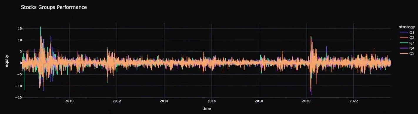
Stocks Groups (Quntiles) Performance
What we see in the graph “Stocks Groups Performance” is a so-called bar chart that represents the monthly percentage change in each stock price, also known as stock returns. The returns can be both positive and negative, so the bars can go both up and down.
What we are going to observe is similar to what we have already seen in the previous article: Q5 (Quintile 5, the yellow line) outperforms all the others. Interestingly, here we not only see that it outperformed in the long run, but it also has higher peaks month by month. What we notice is the high peaks are not only positive but also negative, indicating higher returns but also higher volatility.
If we want to focus on the other quintiles better, we can deactivate Q5 (by clicking on it in the legend on the side) since it’s overshadowing all the others.
In this case, by paying close attention, we see that Q1 is less volatile, and in fact, the peaks are smaller, but this means lower returns, highlighting the different ways in which we can use the different quintiles for different purposes.
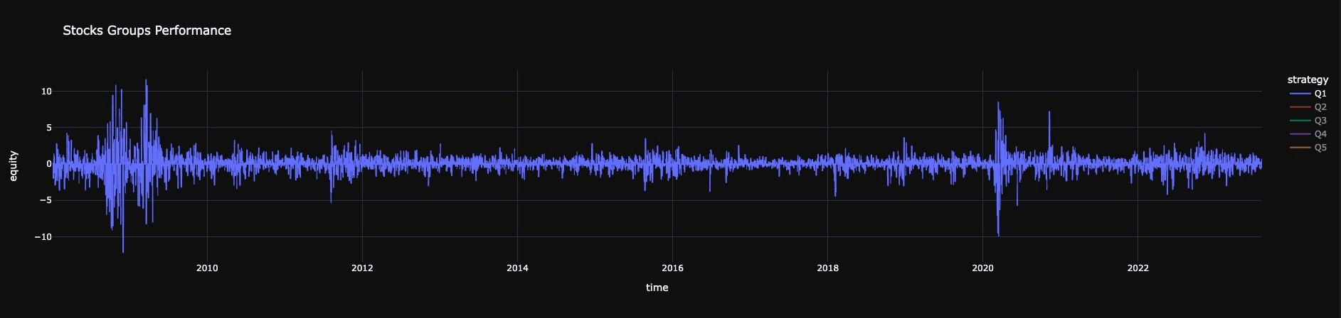
In fact, a strategy focused on the top-performing quintile would be more aggressive, while one where we combine both longing Q5 and shorting Q1 aims to mitigate volatility for a more risk-averse approach.
Was the articles useful for you? Contact us and use Strategies Configurator for building and evaluating your investment strategies.